
Pedro Tamburro is a product designer & design engineer crafting digital products end to end.
●Rio de Janeiro, BR
●Your time
Pedro Tamburro is a product designer & design engineer crafting digital products end to end.
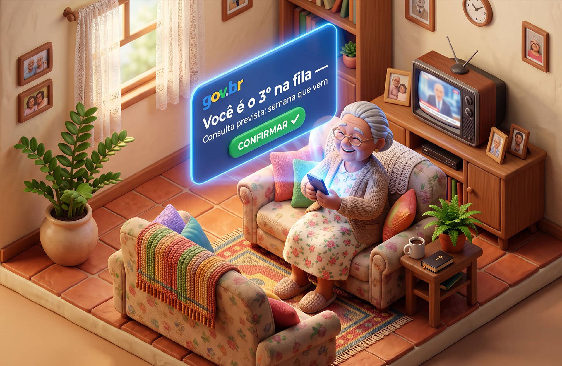
UX Research & Product Design | Case de portfólio
Year
Role
Duration
Team
Tools
View Project
SUS patients join the queue without knowing their position, predicted date or reminders; the only way to follow up is calling the clinic.
UX Researcher & Product Designer, solo: research, benchmarking, personas and scheduling flow redesign.
Navigable 12-screen prototype with React code, on a WCAG-audited gov.br design system, focused on elderly and lower-income users.
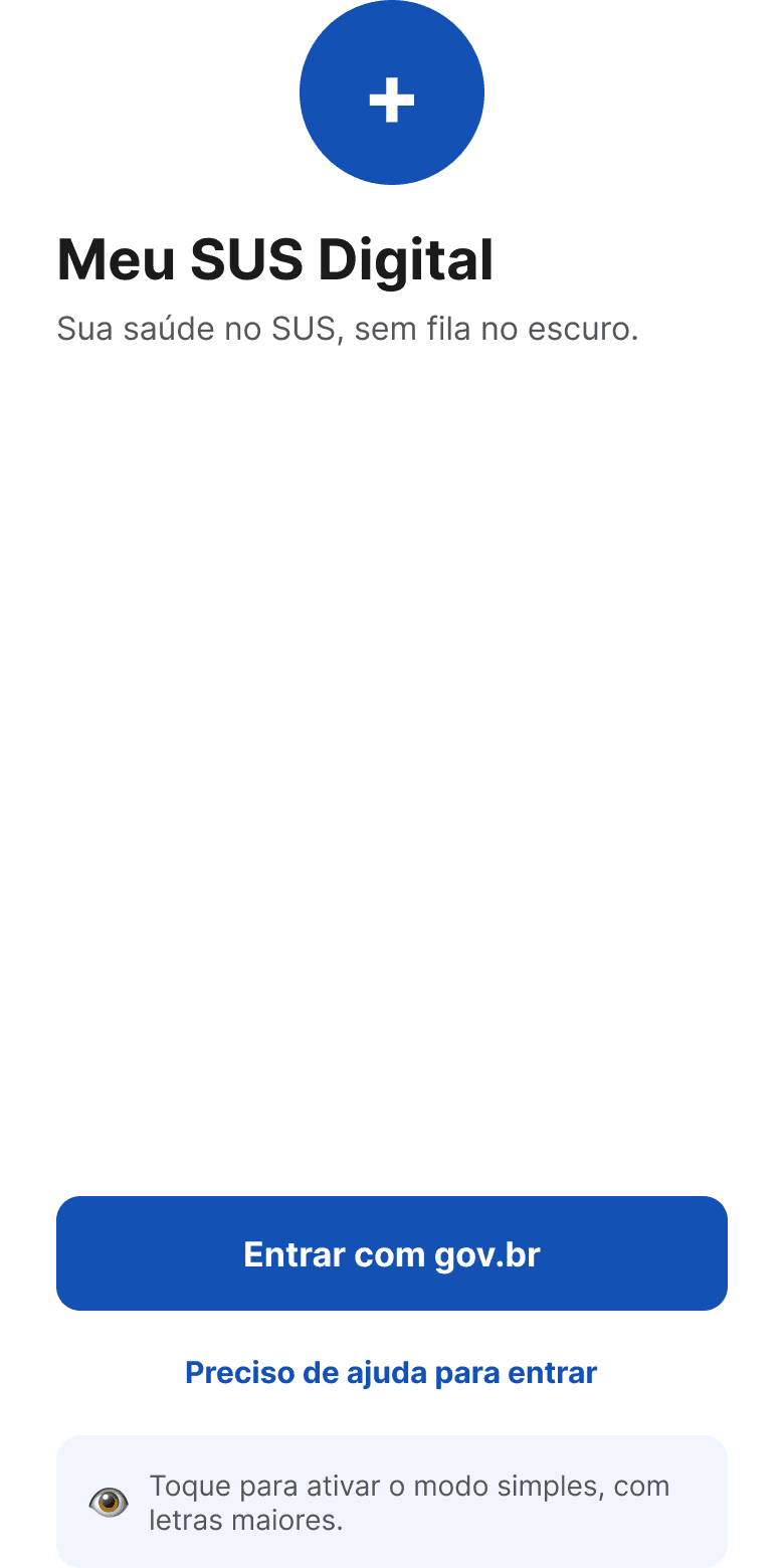
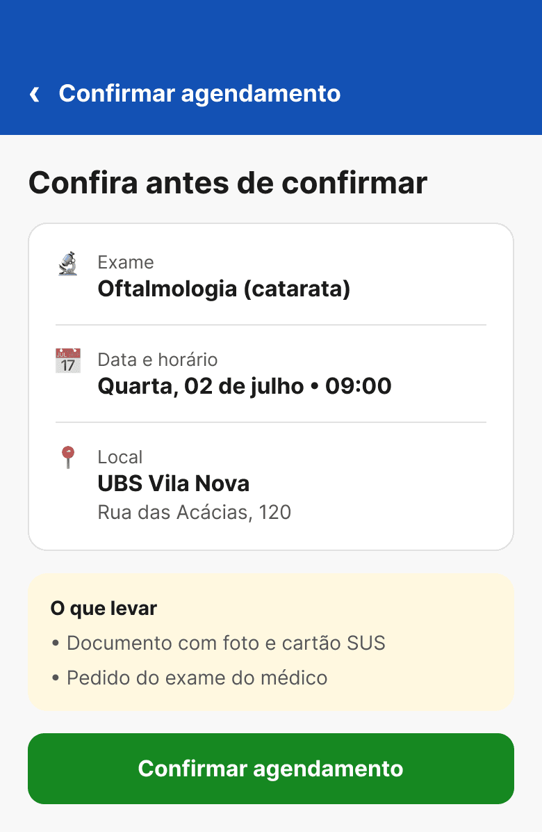
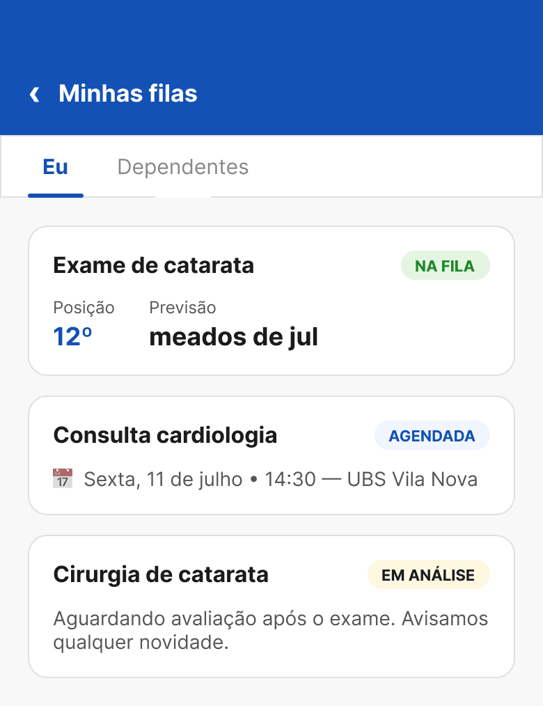
Redesign of Meu SUS Digital's scheduling and intelligent queue flow. The official app has had scheduling since Mar/2026, but without queue position, date prediction, or reminders, that gap is the differentiator. Navigable prototype with 12 screens, WCAG-audited gov.br design system, and React + TypeScript code. Focused on elderly users and lower-income classes.
Meu SUS Digital began offering appointment scheduling in Mar/2026, but only in ~500 cities and only for basic care — and with zero queue transparency. Patients enter the queue without knowing their position, with no predicted date and no reminders. The only way to follow up is to call the UBS. For elderly and lower-income users who depend exclusively on the SUS, this opacity generates anxiety, unnecessary absences, and lost queue spots.
Research confirmed that the transparency gap is not a bug — it's an absence of design. Regulation systems like SISREG have queue position data, but no interface exposes it to the patient. International benchmarks prove it's possible: informed patients miss fewer appointments and trust the system more.
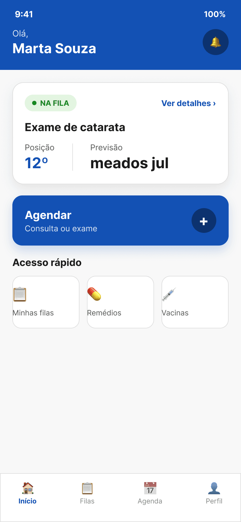
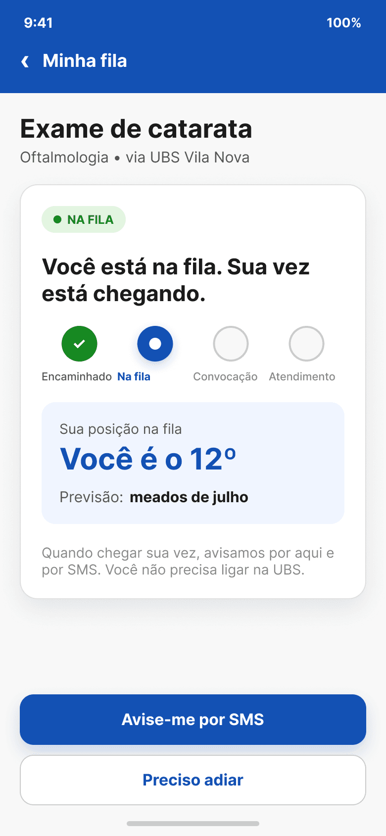
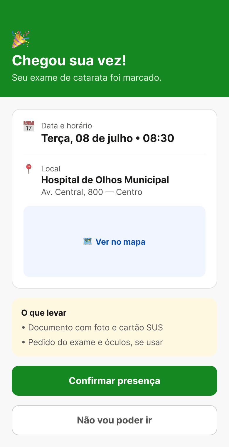
The redesign introduces the Queue Card — the prototype's hero screen. It shows the numerical queue position ("You are 12th"), a date prediction ("Expected: mid-July"), a 4-step timeline with clear visual states (done / active / future), and a reschedule button. Proactive notifications alert when the position changes and when the appointment is near. The design system uses WCAG AA-audited gov.br tokens — blue #1351B4, SUS green #0B6E17 — with accessible font sizes and touch targets for the senior audience.
Full audit with figma-cli a11y. Two tokens corrected before deploy: muted #888 → #6E6E6E (ratio 4.6:1) and success #168821 → #0B6E17 (ratio 5.1:1). Corrections applied at the source tokens — all components update automatically.
The key learning was that queue transparency is not an optional feature — it is the entire product for this audience. Showing "You are 12th" is worth more than any visual ornament. Building the prototype in code beyond Figma allowed testing real navigation, active states, and browser accessibility — impossible in a static prototype.
8 original flow pain points redesigned
